
KOMP
A new paradigm for music notation
Create Something NOTEWORTHY
My Roles
PRODUCT VISION & STRATEGY
USER RESEARCH
UX & UI DESIGN
PROTOTYPE TESTING
BRAND DESIGN

Komp was a collaboration between myself and developer Gene Regan. Gene had built an optical recogntion code base, and my challenge was to shape it into a product: Defining the vision, creating the interaction model and designing the brand and interface.
The Problem
Traditional music notation software wasn't meeting the needs of modern musicians.

-
Desktop-first, dated UI: Designed for big screens and mouse workflows, not touch or mobile.
-
Not portable or usable on-the-go.
-
Overwhelming palettes: Thousands of symbols and options shown all at once.
-
Slow hunt-and-peck workflow: To add a simple note or symbol, musicians had to search through 1,000's of options, then drag it onto the staff.
-
Disrupted creativity: Users spent more time navigating menus than writing music.

I called competitor apps "Everything, Everywhere, All at Once"
The Users
We interviewed over 50 musicians ranging from seasoned composers to newbie instrumentalists. Our research showed us that:
-
Beginning musicians didn't need a music notation tool (yet!)
-
Intermediate musicians needed a faster, easier way to jot down ideas.
-
Professionals were already deeply invested in their desktop apps.
-
Both wanted to compose and edit on the go.


The Opportunity
-
Musicians had entire libraries of scores they created in other software.
-
They had invested years learning those platforms.
-
They didn’t want to start over.

Instead of replacing these desktop apps, KOMP would integrate with them: A mobile companion designed for speed and portability.
The Breakthrough
Nothing like this existed in the market. Starting from Gene's code base, I asked: "What if notation could feel as natural as sketching on paper?" The answer: Real-time sketch entry with machine learning optimization.
How I designed KOMP to work:
-
Guestural input - musicians sketch notation freely.
-
Machine learning optimization - the app instantly recognizes and converts strokes into professional notation.
-
Results - the speed of sketching, the precision of engraving.


UX Design Decisions
I focused on removing complexity and keeping the score front-and-center.
-
X/Y axis paradigm: The app is based on a single, simple paradigm of duration and pitch.
-
Focus on contextual menus: "Only show what you need, when you need it".
-
Utilize native device touch features: Press/drag-to-duplicate, flick to delete, draw line to create melody.
-
Show minimal palettes: Remove clutter and complexity from editing screens by only showing universal functions on palettes.

X/Y Axis paradigm allows super innovative input methods like drawing a line to create a melody (using native accelerometer to detect speed and direction)
Contextual Menus
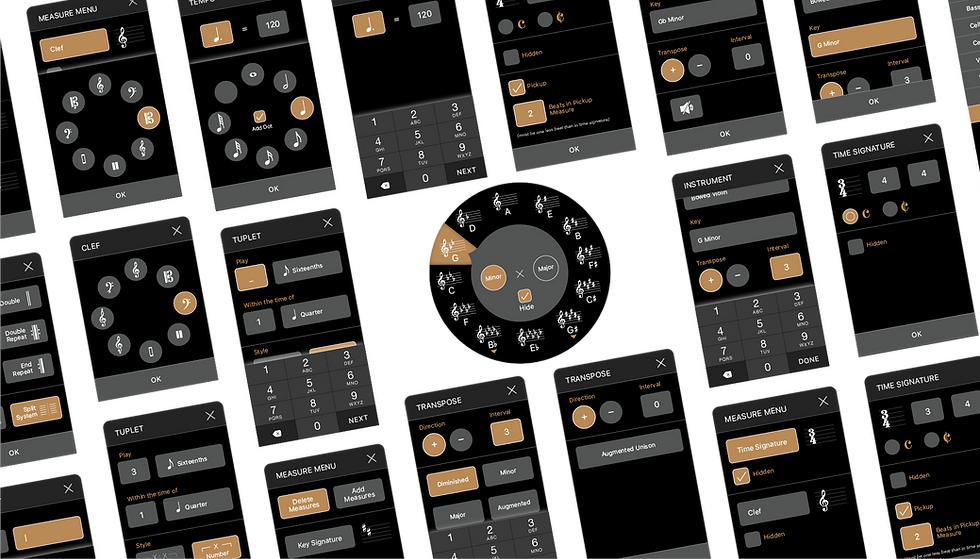
More Complex Editing
Every interaction was meticulously defined and tested in builds. Below are images from my technical specification.


See it in Action
Users simply draw a circle to create a whole note and a slash to create a quarter note; the fastest notation input in the industry.
Additional Screens
-
Carousel score view
-
Instrument setup
-
Templates and library organization
-
Editing tools in action


Results & Reviews
Reviews from publications:
“The tool palettes are clean, minimal, and unfussy, allowing you to focus on the score itself.”
“The user interface is strikingly modern, as clean as any you’ll find in the App Store, including Apple’s own apps. The typography, colors, and general design language of Komp are a genuine pleasure to work with.”
* Scoringnotes.com

What we learned
-
A tiny team working closely together (designer + developer) can accomplish incredible efficiency.
-
Proved a new paradigm for mobile notation was possible.
-
Validated that mobile format could complement desktop.
My contributions
-
Defined the product vision and strategy.
-
Translated raw code into a usable, branded experience.
-
Designed the interaction model, UI system, testing protocols, and feature sets.
KOMP showed how machine learning + UX design could modernize a decades-old workflow, and how thoughtful design can spark entirely new ways of making music.
Case Studies

HELSA designed a Machine-Learning app that turns handwritten sketches into editable digital scores instantly.

HELSA built a design practice that elevated craft, consistency, communication and excellence.

HELSA transformed dated, disconnected apps into a unified and revenue-generating suite of educational tools.

HELSA imagined a patent-pending, innovative solution to lesson planning and delivery.